


Images updated February 2020
Black and white photography is a unique way of seeing the world. It's also quite a popular genre of photography. Lightroom is not only a great tool for post-processing black and white files, but it allows for the creation of black and white files from any color photo. Processing your photos in this manner is a great way to experiment with visual perception and to get out of a creative rut!
An ideal method for black and white photography is through use of an adequately matched black and white preset. All Luxe collections come with several black and white options.
If you don't have the luxury of presets, you can also transform your picture to a basic black and white and then fine-tune each of the settings. Regardless of your method, it's important to understand the basics of black and white processing. This tutorial will cover this process in Adobe Photoshop Lightroom Classic, and covers many features to Lightroom Classic versions 5+.
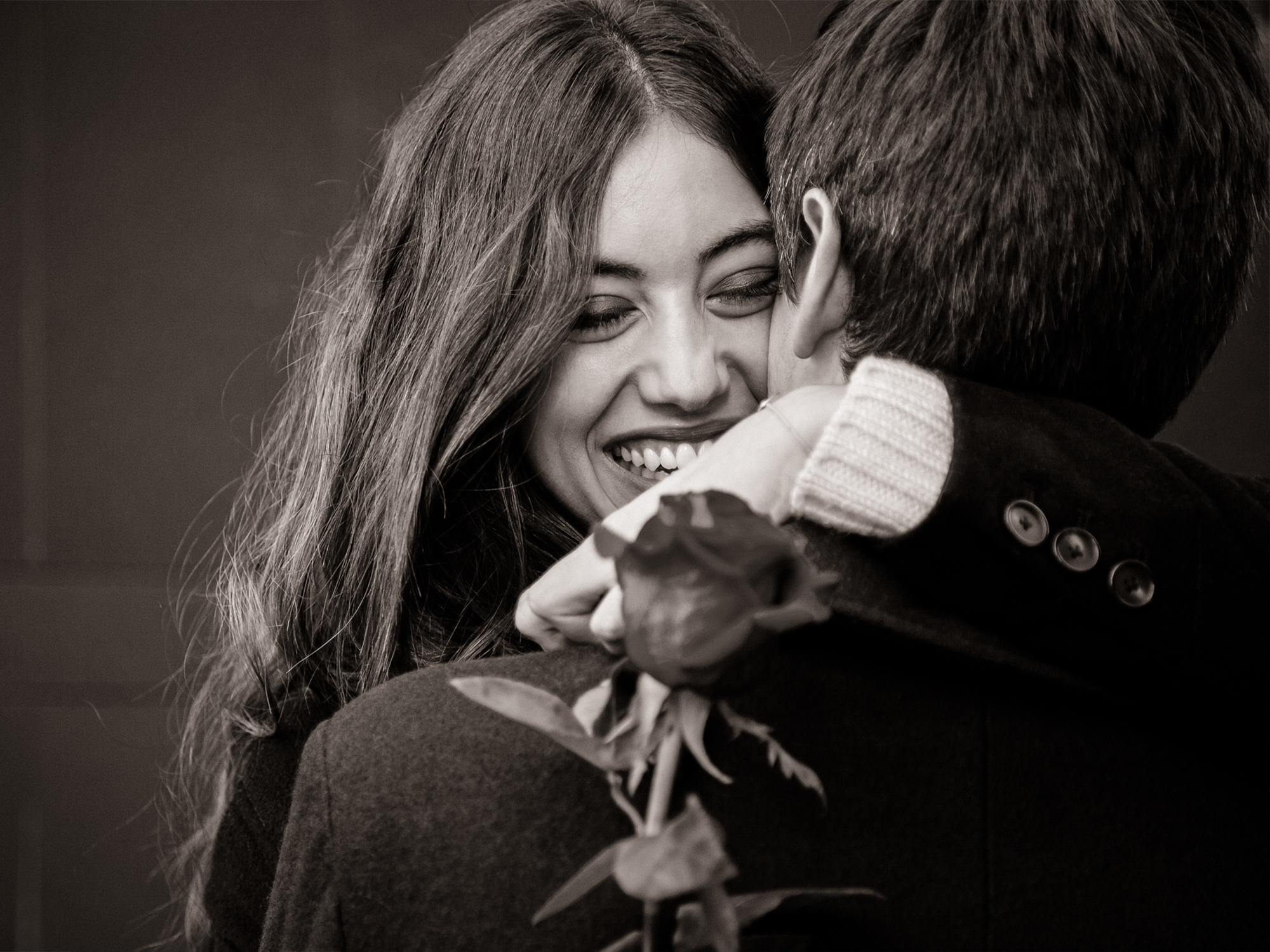
Here is the starting photo:

It is certainly nothing to shout about. Therefore, the aim of the black and white conversion is to produce something more attractive and stylized. We begin by creating a virtual copy of the photo by right clicking on it and choosing "Create Virtual Copy":

Note that this can be done in both Library or Develop mode. It doesn't take much storage space (no file duplication takes place because the process is "virtual") and is great for comparing our work to the starting image. Now we're ready for our conversion. In Develop mode, at the top right of the Basic panel, there is a tab labeled "Black & White".
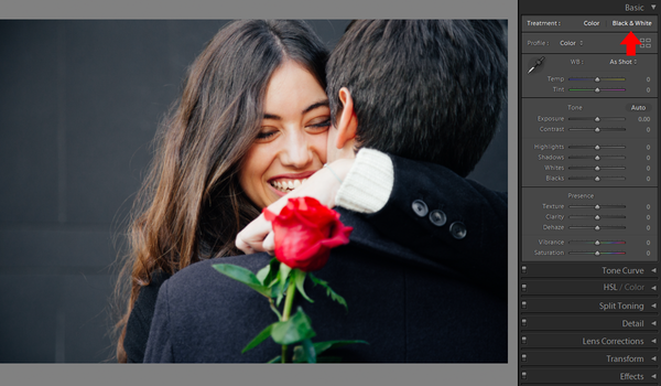

Basic Panel
Tuning the image to our liking is the same as in the color space (with the lack of the vibrance and saturation sliders, of course), but with one major difference. The black and white workspace allows for much more drastic slider moves with no detriment to the end result. Extreme slider moves that tend create annoying over-saturation and distortion of color now give our black and white image a more gritty and attractive look! Notice how far I go simultaneously with the Texture, Clarity, Whites, Shadows, and Highlights sliders and how much better the image already looks relative to its color version.


HSL/B&W Panel
In the same manner as with the Basic panel, it's best to click on the "black and white" tab on the top right of the panel. Things here are straightforward in the sense that we can only control the Luminance of each color channel. To be successful, let's not forget that reducing Luminance makes the corresponding channel darker and at the same time more saturated. The dominant sky and plants in our example began as blue and green, respectively.
If you have trouble in identifying which color channel is where, all you have to do is jump back to the color original, which is an additional advantage of using virtual copies in the process. Alternatively, press the backslash key (\) to toggle between the photo's before and after states. In the particular example, I chose to slightly darken the blue channel in the sky, the green channel in the jungle, and the yellow channel in the water in order to give a stronger "body" to these areas.

Split Toning Panel
Split toning is our opportunity to depart from pure black and white by attaching tones of particular colors to the highlights and the shadows. Here, subtlety is key. As a warning, split toning can sometimes result in some terribly overdone results. Start by boosting the highlights saturation slider to a very high level (50-60). Next, choose the highlights tone from the hue slider just above it. Then, return the saturation slider to a lower level. Repeat with the shadows sliders. For our example, I chose an aqua tone for the highlights and a yellow-green tone for the shadows. There is no right or wrong here, but finding the right combination often takes time and experimentation.

Detail Panel
No photo is complete without sharpening. Black and white tones and noise go well together. So switch to 1:1 scale from the Navigator panel and experiment with major increases in the Amount and Radius sliders.

Effects Panel
Once you've mastered the perfect amount of noise within the Detail panel, transition to the Effects panel. Here, take some time to alter the Amount and Size sliders in the Grain sub-panel until you're pleased with the outcome. I've chosen to complete my image by adding a subtle vignette.

The final result is quite a departure from the initial color photo, but I'm quite pleased with the result. Let's do a side-by-side comparison of the initial color image and the final black and white product:

About the Author: Dimitrios Matsoulis is an engineer that studied in the UK and has an industrial automation and solar energy background. His love for outdoor activities and photography has naturally led him to photo editing. He uses Lightroom and Photoshop for his own photography, as well as freelancing gigs. He lives in Greece and maintains his online presence via his personal photography blog, 500px and Instagram.